YAHOO FINANCE
Terminal Options

Yahoo Finance Terminal is a stand-alone product for subscription members only. It switched the focus from conventional news content consumers to data-driven retail investors. As the first feature for Terminal, Options provides a dynamic, signal-seeking experience designed specifically for mid-level to advanced retail investors.
The development of this new feature started from ground zero. The main challenge was to gain a thorough understanding of the business requirements and user needs, while also ensuring the Back-end and Front-end engineering had the capabilities to support the data availability and infographics styling.
🕛 3 months, 2022
🤝 1 Designer, 1 Product manager, 1 researcher & 4 Engineers
🧩 Product Design Lead
🖥️ Desktop | Web App
Background
& Foundation
Current YF Plus isn’t meeting the expectations of subscribers.
It’s a scattered experience.
For a paid service, people expect a “premium” experience.
The Terminal Team consisted of 2 designers. One designer leading the overarching framework and I focused on Options Flow feature.
🔩 Always on Tools
🔍 Search As Navigation
.png)
Business Goal
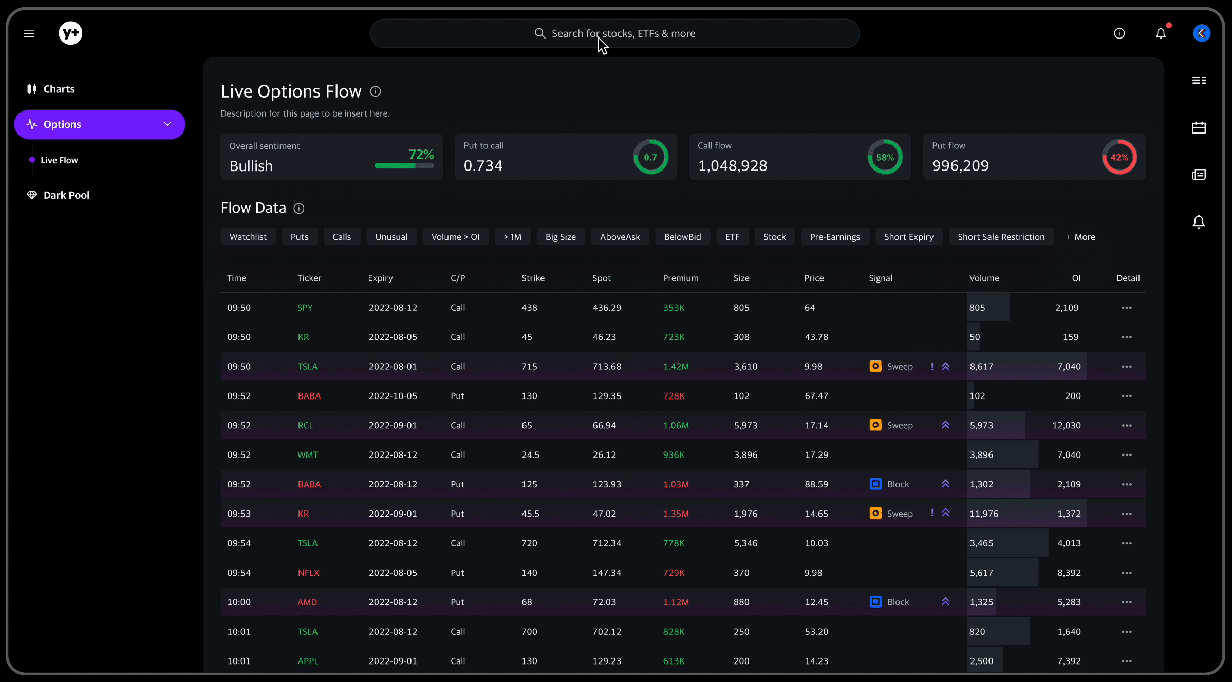
Catering to options traders, which to YF is a largely untapped audience, the business planned to start with Options Flow as the first step.
The business goals for Options Flow are as follows:
🎯 Increase business revenue:
The aim is to generate additional revenue by introducing a premium membership value that provides enhanced features or benefits to users.
🎯 User acquisition:
The objective is to attract and acquire new frequent trading users for the product.
By achieving these goals, the product aims to drive overall business growth, enhance monetization opportunities, and establish a strong user base.
The Users
1. Advanced users:
good understanding of the market, capable of conducting fundamental research and data-driven technical research
2. Mid-level retail investors:
want to level up their investing strategies, starting to develop some understanding of financial data


[ User Interviews ]
User Goals
Our users' ultimate goal is to make confident investment decisions by leveraging Options flow information.
The Problems
⛔️ Data complexity and interpretation difficulties
Most Mid level retail investors mentioned. Understanding the various terms and symbols requires a long learning curve. It’s not easy to interpret options data accurately and effectively. Users struggle to analyze data and extract meaningful insights to support their trading decisions.
⛔️ Data overload
Many users find the influx of options data overwhelming, facing the challenge of sorting out the key information that serves as valuable trading signals.
⛔️ Limited data accessibility
Some advanced investors mentioned the accessibility to real-time data and some data sources are restricted to professional investors only. There are always secret big trades moving the financial market.
User Needs
An intuitive experience to read and understand the options data.
They want to get meaningful insights to support their trading decisions, especially big signals on volume, premium, implied volatilities, etc.
Design Challenge
HMW design an intuitive experience for mid-advanced retail investors to seek signals of options flow?
Design Solutions
1. Reading experience starting from an anchor.


2. Customizable data panel
Prioritize information based on the needs of investors in all-levels
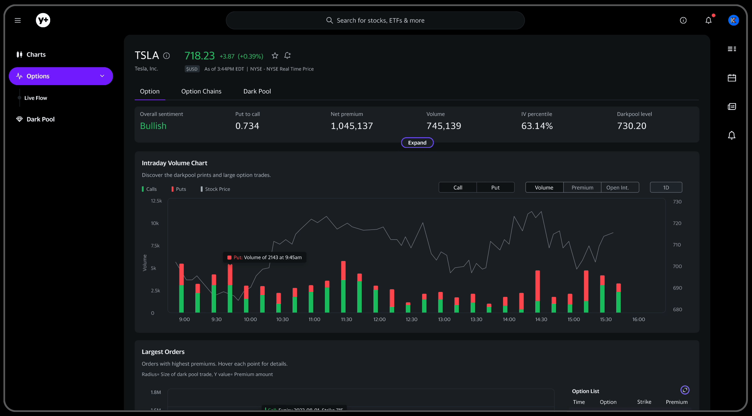
3. Highlight signals using visual treatment

User Testing
I collaborated with UXR defining key questions to confirm with users as well as the way to frame the interview process.
The objective of this testing round is to assess the following (Design + Business):
1. Design Appeal
3. Use Frequency
2. Options Needs
4. Pay Willingness
Findings:
1. Users find it easy to access the options data for a specific company from search, overview, and LIVE opinions flow pages. There is a big need for watchlist.
2. Users find most of the critical information they care about, such largest IV, and premium data could be easily accessed. Most retail investors can understand the critical information leading each page as presented and they found it concise and useful. Users mentioned the bar chart has some confusion.
3. Users love some clarities around the dark pool and they are very specific about purple. So on the option chain page, the purple fire was called out.
4. Users are willing to pay monthly $20 just for Options Flow after a trial period 🙌
Quick Iteration
For the time constraint, I was only be able to address #2 in this sprint. And save watchlist feature for the coming phase.

Before

After
Up Next...
A guide for Dock's design with the considerations of the new business strategy and user experiences.
.png)