YAHOO FINANCE
Dock Design Guidelines

.png)
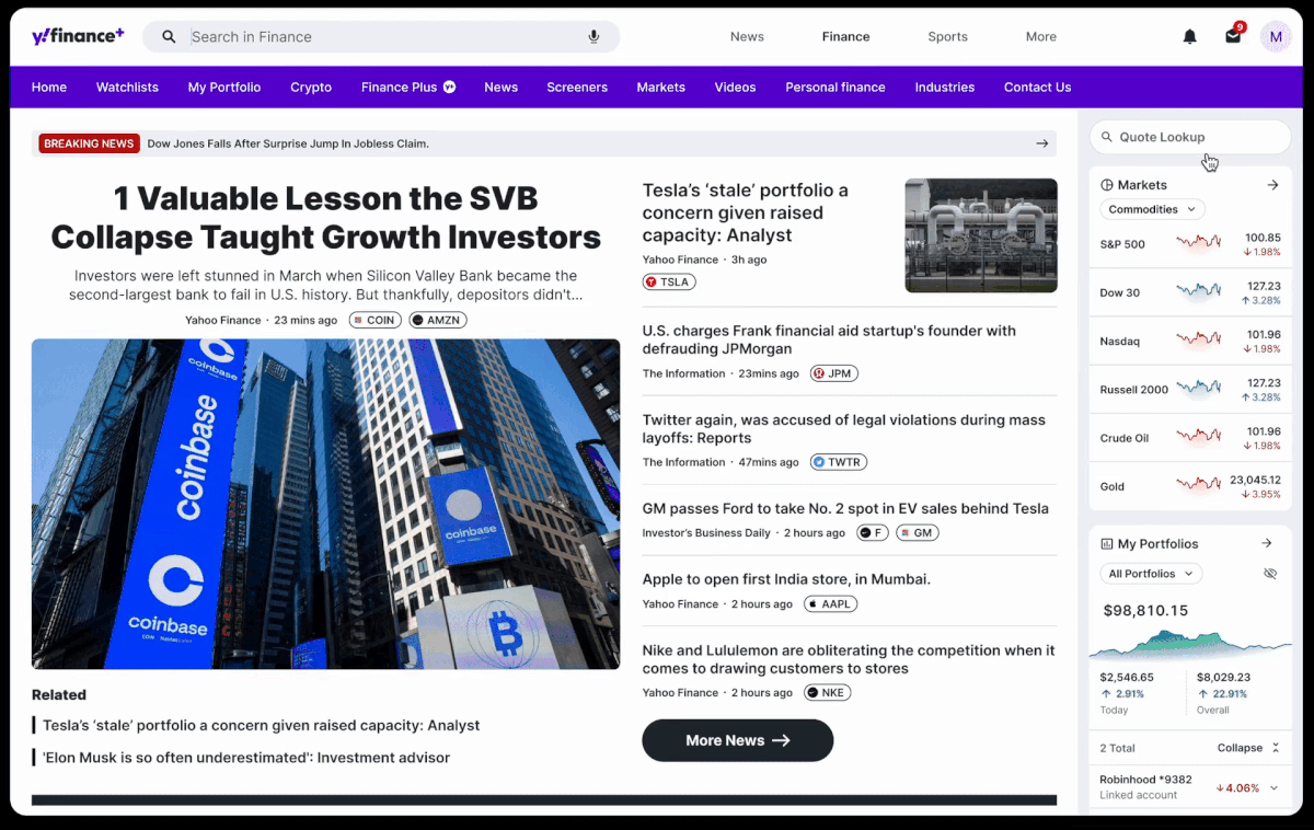
Yahoo Finance Homepage is introducing a new feature - Dock. This innovative tool provides users with ready access to key information as they navigate the site, enhancing their browsing experience.
As Design Lead of the squad, I partnered with the Homepage PM to ensure alignment with high-level product strategies. Then, I collaborated with various squad stakeholders (PED) to gather insights for use cases and determine the most valuable snapshot of information for each widget that would benefit our end users. Over the course of a three-week project, I established the dock design guidelines and provided guidance to widget designers for individual widget designs.
The bucket test was quite successful, we got over 200% increase in Market Overview, Trending Tickers, and Quote Lookup engagement.
🕛 3 weeks, 2022
🤝 1 Dock Designer, 2 widgets designers, 3 Product managers, 1 researcher & multiple Engineers across squads
🧩 Dock Design Lead
🖥️ Desktop and Mweb
Background
Yahoo Finance is undertaking a new version of homepage experience.
From the past research findings, one of the primary needs of users when visiting Yahoo Finance is to obtain a quick and informative snapshot of the current market conditions. They are keenly interested in staying up-to-date with the latest market trends and developments, as well as tracking the performance of specific stocks of interest.


(Content of high user engagement on current YF homepage)
User
Problem
At present, these high-engaged information is only available on Homepage.
As users navigate to other pages, they lose quick access to these high-value data points.
Product
Hypothesis
Some competitors incorporate Dock as a site-wise feature have successfully addressed our user problems.
We believe that by building a dock for YF users, we will provide users a snapshot of market and portfolio, which will help users stay informed with the market and make investment decisions wisely.
Product Goal
In essence, Yahoo Finance needs to serve as a comprehensive and reliable source of real-time financial data for the user to stay abreast of market conditions and their impact on portfolios and holdings by:
🎯 Increase user engagement by integrating these high value information to New Yahoo Finance Homepage.
🎯 Expose hidden features (tools and services) that would be useful for retail investors.
The Users
Primarily cater to active traders and investors who require a flexible and customizable investing insight platform.
.png)
I want to keep an eye on my watchlist when I browse news on Yahoo Finance.
.png)
For some big event days... like SVB bank drama, I want to monitor the market and stay up to date of the financial world.

I recently just started to learn investing... When I read some news, I always intend to glance at my portfolio... I want to make a connection to understand if these events will impact my portfolio performances.
User Goals
1. Stay informed of the market
2. Make confident investment decisions by leveraging portfolio and watchlist
Something to keep in mind...
Through the analysis of various financial competitors and products like TradingView, Bloomberg, Apple Dock, and Google Cloud, I have identified key considerations that should be taken into account when designing the dock feature.
📊 Less Complexity
🔦 Information simplicity
👁️ Easy scanning
User Needs
A quick snapshot experience
to understand the financial market and their portfolio lists.
How to design an experience that facilitates quick comprehension of the concise, personal-relevant and timely information from the market and watchlist?
Design Solutions
1. Framework
& Consistency
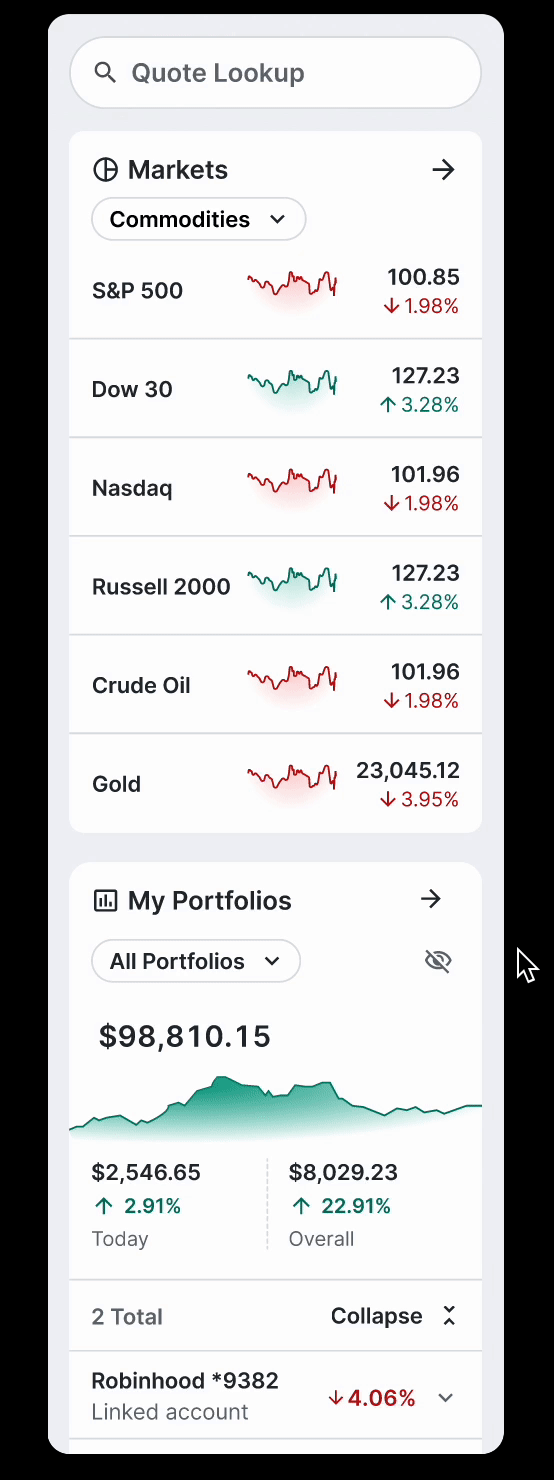
The dock is 250px wide by default. It will be docked on the right edge of the homepage being part of user journey.
In MVP, Product and Design teams decided to move forward without dock collapse.

To keep the consistency of the UI, I tried to utilize the existing components from the library, otherwise I contributed new components and worked with system designer to fold in new elements for dock and widgets specifically.


2. Usefulness
From user research and data, we knew the information on widgets to the right gain the most engagement. Product and design decided to organize the information based on users' priorities.
Edge case:
Some advanced users love to customize the order of widgets due to their different investing habits. So we added a re-arrange feature (see prototype)

The Order of Widgets
by Default
Re-arrange the widgets
3. Glanceability
Work with Product partners and choose a single idea for your widget. Simply start from some basic questions:
-
What is the main purpose of this widget?
-
What do users need when they take a glance at the widget?
Throughout the process, use that idea to keep the widget’s content focused and relevant.
Highlight the most critical information and deliver to users upfront. Keep aligned to design system for information classification.

Insight-centric widget
List- based widget
2 typical kinds of widgets
UXR | Ticker Line Test

Success
From the analytical team data, the dock bucket test was very successful, yielding significant increases in user engagement as follows:
🔍 Quote Lookup:
🌐 Market Summary:
☄️ Trending Tickers:
↑32%
↑372%
↑291%
Next Step
Looking ahead, our roadmap outlines several key tasks to be tackled in the coming phases.
1. How to work with the responsive grid to collapse the dock?
2. At present, it is not possible to differentiate between the watchlist and portfolio with holdings. Once backend support is available, what is the recommended approach for separating the watchlist experience from holdings? Additionally, should we anticipate a lengthy scrollable dock?
Responsive Grid (WIP)
for Dock States

With Dock Open
(Default)

With Dock Collapsed

Enable to collapse dock to benefit full-screen chart users in the next phase.
Business will expand to link brokerage accounts for investment and cash.
Enable each widget to collapse to reduce the long scroll
Diversify the UI language
Seperate watchlists from portfolio holdings
Up Next...
A mobile-first investment platform that offers a one-stop solution, built on professional insights and social media integration.
